CMYK, RGB What?
By now, you’ve probably realized that career graphic designers use many acronyms in their daily jargon. However, these terms can confuse those entering the design industry or business owners trying to design some quick graphics! Two of the terms that tend to confuse up-and-coming designers are “RGB” and “CMYK.” You may have seen these in an article or on the back of some user manual, but what do they mean?
RGB and CMYK are “color modes” and describe how devices, specifically screens and printers, understand and produce color. TVs, computers, and phones all have screens comprised of pixels, which display color using RGB values. RGB, which stands for Red, Green, and Blue. Printers use CMYK, which stands for Cyan, Magenta, Yellow, and Key (Black). When you replace an ink cartridge in a color printer, you will probably notice that each cartridge has a label: C, M, Y, or K!
As end-users, we often do not think much of RGB and CMYK; we want the applicable devices to work! When we turn on our TV or print a photo, we want to see color, not black and white. However, as designers, it’s crucial to understand RGB and CMYK. If we create an RGB-based design and print it out, the colors will not look right. Similarly, if we design a graphic in the CMYK mode and put it on a website, the colors will not appear correctly on a computer.
In this blog, we will go over which color mode to choose and how to properly set up a document in three Adobe Creative Cloud programs: Photoshop, Illustrator, and InDesign.
For Digital Graphics, RGB Is Our Friend
If we design a graphic for a website, social media, or phone, we will want to use the RGB color mode. I always ask myself what the end medium for my design is. In this case, since people will see the design on their computer or phone screen, we need to use RGB so that it plays nicely with the screen’s pixels.
Typically, it is best to use Photoshop when designing in the RGB color mode since Photoshop is pixel-based. However, there is an exception. If we create a vector (SVG) icon for a website, we should use Illustrator since it is vector-based. We will cover the difference between pixels and vectors in a later blog. For now, we will focus on Photoshop.

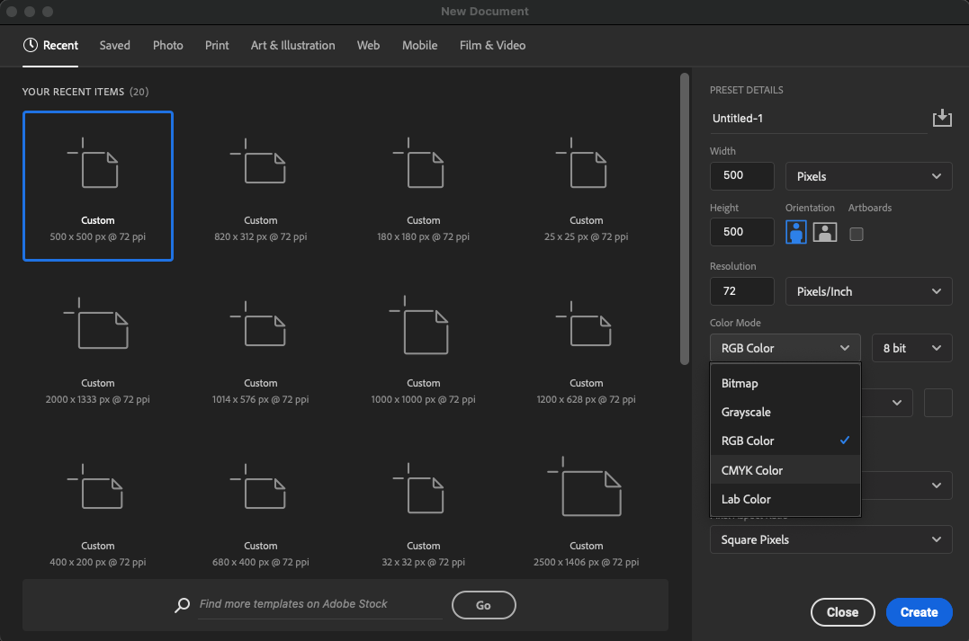
When you create a document in Photoshop, we can select the color mode via a dropdown (it is set to RGB by default). We also want to ensure our document’s resolution is 72 pixels/inch (PPI). A standard screen resolution is 72 PPI. Since we’ll publish this design to a screen-based medium, we want to mirror the resolution properly.
For Print Graphics, Use CMYK
If we design a graphic for print, like a flyer, brochure, or booklet, we will use the CMYK color mode. Since printers use cyan, magenta, yellow, and black ink to print color, we want to ensure our designs match this. With print graphics, we use Illustrator or InDesign.
As a novice designer, I followed the mantra that Illustrator is for single-page print graphics or a collection of printables that vary in size (e.g., a campaign flyer and postcard) and that InDesign is for programs or booklets. However, as I’ve worked with more designers, there is a gray area. Some designers love using InDesign for quick, single-page designs due to the ability to create (and change) character and paragraph styles, among other benefits.

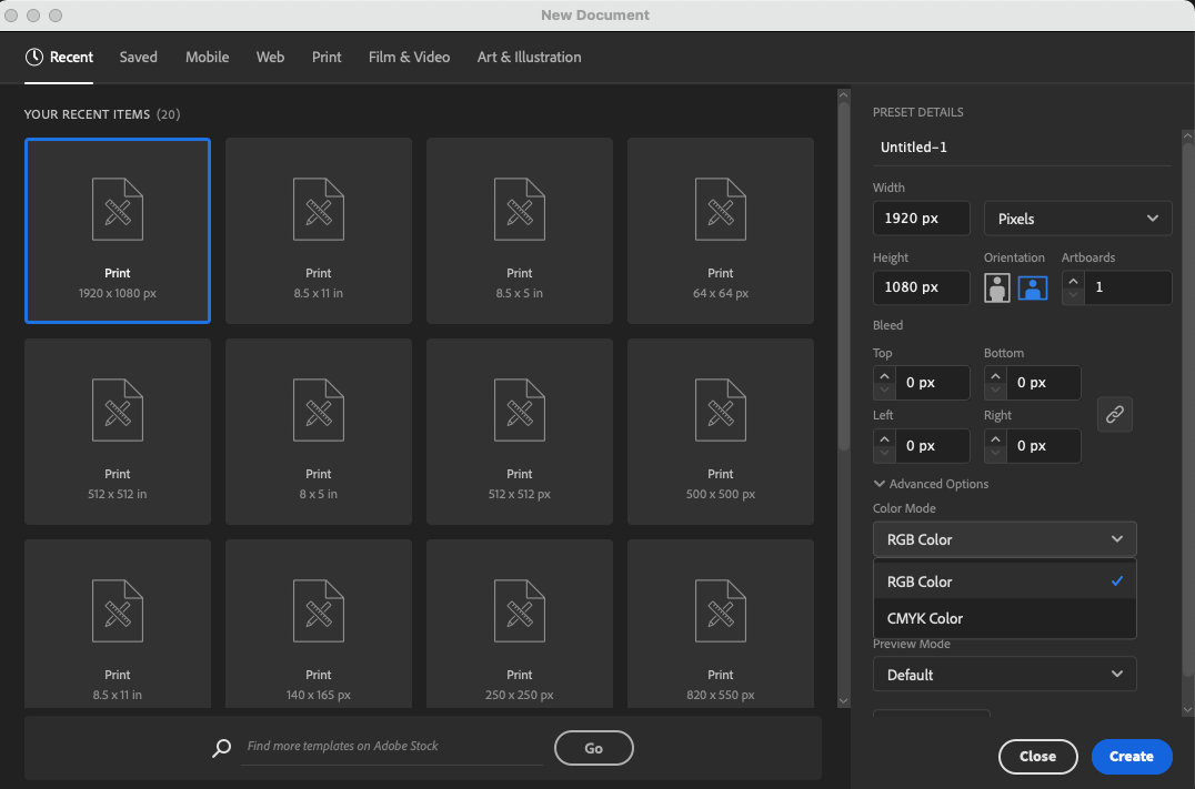
In reality, it is your choice of what program you prefer to use. Illustrator has a color mode option when creating a document, while InDesign sets the color mode to CMYK by default. Also, as with screens, there is a recommended PPI for print: 300 PPI, which ensures our printed colors are crisp and sharp.
We can also use the RGB color mode in Illustrator, which comes in handy to create a PDF or to design some vectors for use online. As with Photoshop, if we use Illustrator to design for screens, we will switch to the RGB color mode and change our raster effects to 72 PPI via the dropdown.
Why Does This Matter? Red is Red, Right?
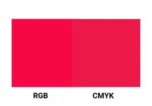
Well, actually, in terms of screens vs. printers, red is not red! Take a look at the graphic below. There are two squares, each with the “same” red in different color modes. They are not the same! The RGB square looks more vibrant, which makes sense because RGB produces more vibrant colors that only display on screens. This simple graphic highlights the importance of ensuring our designs use the correct color mode.

We can spend all day choosing the best color palette and creating a beautiful graphic. However, if we use CMYK for screens or RGB for print, the color you see on the screen will not match what you see once published. Save yourself frustration and confusion by following this rule of thumb:
- Use RGB and Photoshop for digital designs
- Use CMYK and Illustrator or InDesign for print designs
There are always caveats, but in most cases, the above rule of thumb serves beginning designers and at-home creators quite well.